June 27, 2010
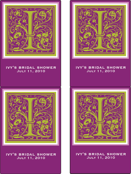
Earlier this week I made custom wine tag labels for Carol. She was looking for something a bit more bold and really wanted the labels to stand out. While I had color matched the color sample she provided me with, the colors didn’t show as dark on my computer screen as they had on hers. What looked purple on her screen looked pink on mine! After providing Carol with my printable color chart as a reference, she chose colors that best reflected her color scheme, and we revised the look of her wine tags!
I like these labels much better. The square monogram compliments the rectangular label, and the colors are bold and striking. These are sure to make a hit at the bridal shower Carol is hosting!
Remember, color varies from monitor to monitor and printer to printer! I highly recommend printing out my color chart on the paper you plan to print your stationery on to get an idea of how the colors print on your paper of choice.
