May 3, 2022
Have you ever scrolled through a website or walked pas a sign and thought to yourself, “That’s a really nice design!”? Chances are, a designer spent a lot of time deciding what font pairings to use — the height of the letters, the spacing, and the style. Fonts are one of the most important decisions in any readable design. Typography, or the style and appearance of the printed matter, makes a good design great.
So, what does this meant for you?
Your suite of wedding stationery (your save the dates, formal wedding invitations, escort cards, table numbers, wedding signs, etc) will all have fonts. What these fonts look like, and how they’re used throughout your stationery, matter! The way they’re grouped together help clue your guests into what to expect for your upcoming wedding and therefore, help them decide what to wear.

Playing with Pairings
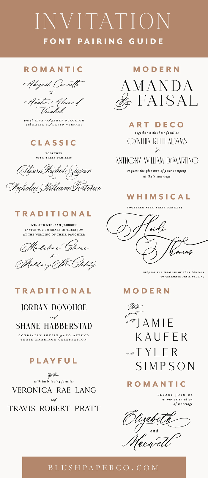
I normally use 2-3 fonts when designing wedding invitations. Using one font would be boring! This is where the art of font pairings and font duos comes in. There’s a few things to keep in mind when pairing fonts:
- You’ll want to pair a serif font (projections on the end of the letters) with a sans serif. Fonts will often clash or compete for attention if they are too similar.
- You don’t have to use a ton of different fonts to get your message across. Use variants of the same font. For example, popular elegant font Didot is available in bold, regular and italic. You can also use Didot in uppercase letters to change up the look subtly.
- Consider the order in which information is read, based on the typeface position, scale, and style. For example, the reader’s eye will be drawn to a large, bold script at the top of the invitation before they see the petite date and time towards the bottom.
Did you find this post useful? Would you like to get back to it later? Save THIS PIN to your Wedding Planning board!
