May 17, 2017
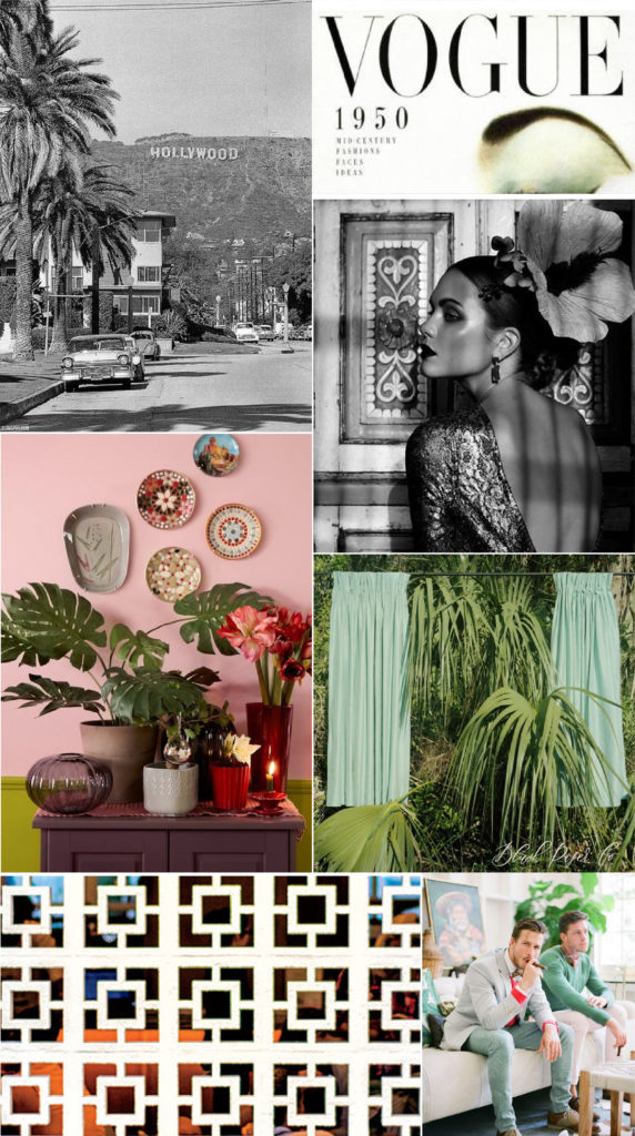
Designing a mood board is an integral part of our design process at Blush Paper Co. It helps guide the tone for the entire project, and acts as inspiration as we move through designing each element of the project.
For us, it’s all about the feeling it creates. The point of a mood board is to have a comprehensive, visual vibe for your entire project. It’s not a place to nail down specifics, like fonts or exact images, but rather selecting imagery and colors that reflects the feel that you want to convey. What era would your wedding stationery live in? If you were to step into the invitation, where would it take you?

This isn’t always a ‘what you see is what you get’, though: for instance, this mood board has muted colors and a neoclassical font – so you won’t be any modern calligraphy or neon pinks in our finished suite. But you can expect to see tropical patterns, clean lines, muted colors, a nod toward the 1950s, and our signature glamorous look that you’ve come to love.
Want to follow along with more of our inspiration? Follow us on Pinterest and Instagram and join the conversation!