September 11, 2017
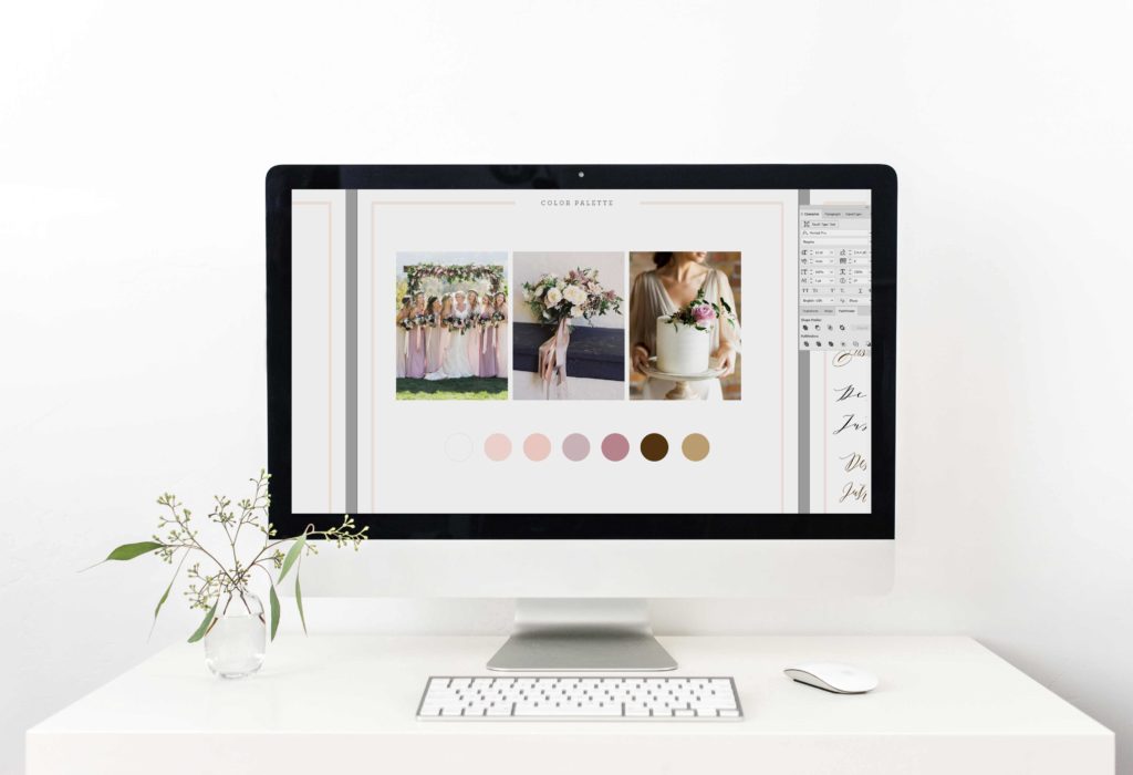
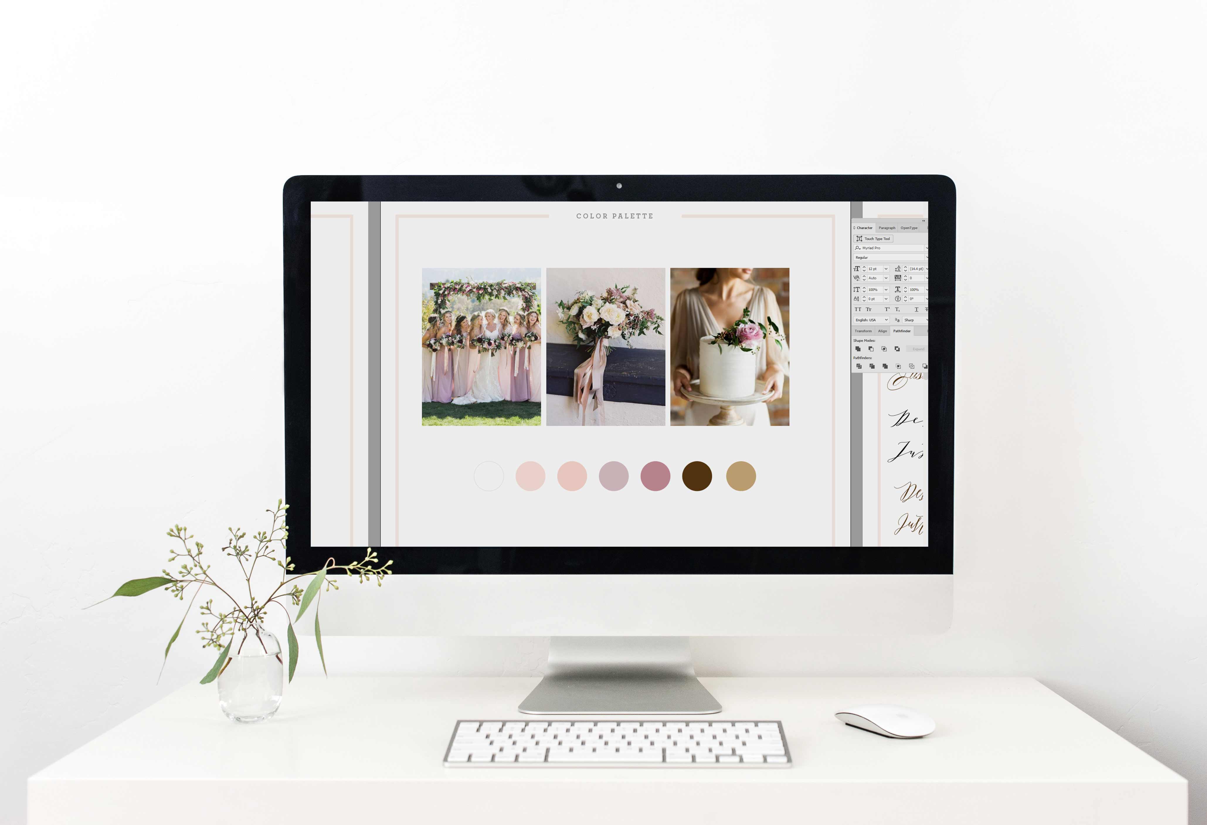
Desiree came to us looking for a country rustic save the date announcement. She wasn’t sure which of her photos she wanted to use, so we suggested she sent over a few of her favorite so she could see them in action! Using her inspiration photos from Pinterest, we put together a look book and created a custom color palette along with a suggestion of our favorite fonts. Her inspiration images really helped inspire us when it came to her font selections, but we also wanted her feedback as well! We believe in branding from top to bottom and we are designing Desiree’s invitations as well — we designed a quick mock up of her invitations so we could nail down the font selection.
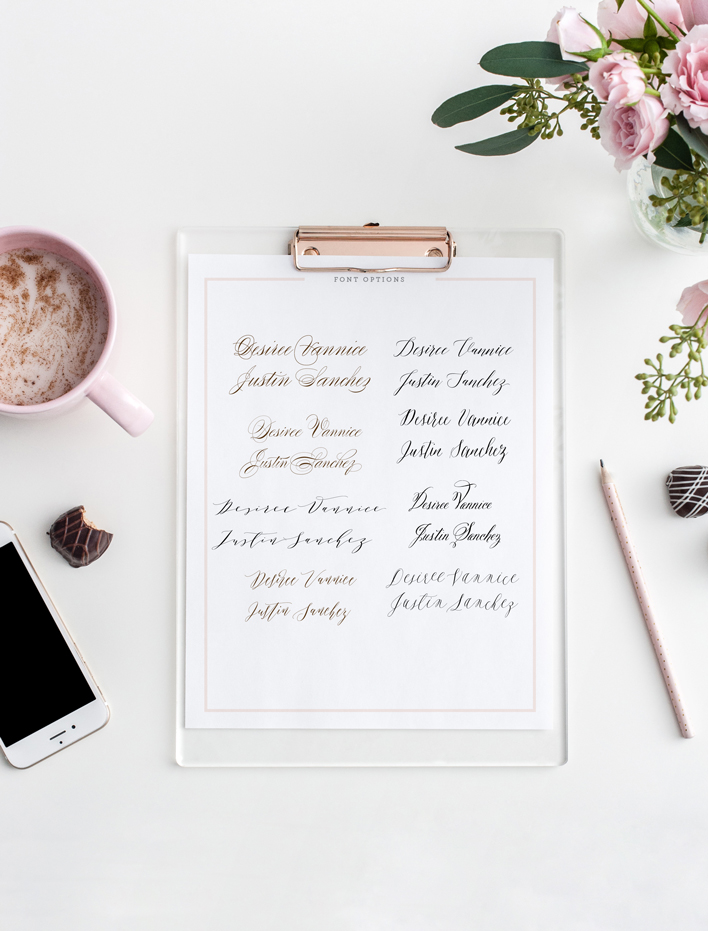
Then comes the really fun part — bringing everything to life! I have to admit it was super difficult to choose a photo because they were all so incredibly gorgeous. We gave Desiree several color options as well, and throughout each round of proofs showed her four different options and font pairings.
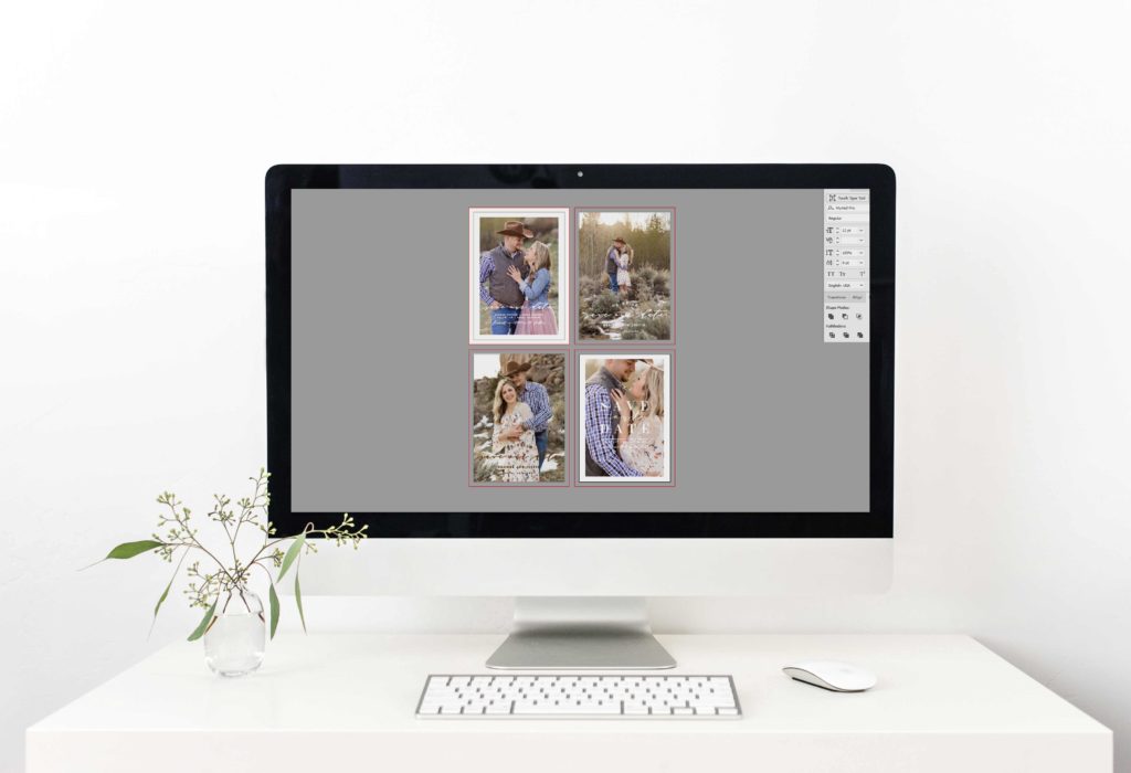
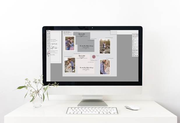
Similar to designing wedding invitations, we provide a style sheet with our save the date announcements. It’s so helpful to see everything laid out side by side so you can compare layouts with color selections.
In the end, she selected her favorite design (secretly out favorite as well!) and we sent her a hard copy proof with both slate and blush envelopes. Sometimes, it’s so hard to make these little decisions — even things like envelope colors play such an important role!

Interested in becoming a #blushbride? We’d love to hear all about your wedding & learning more about you! Contact us today to get started on your 2018 wedding stationery!

[…] we opted for above/below cabinet lighting. And from a functional stand point, I am SO glad we did. To see how we DIY’ed our cabinet […]